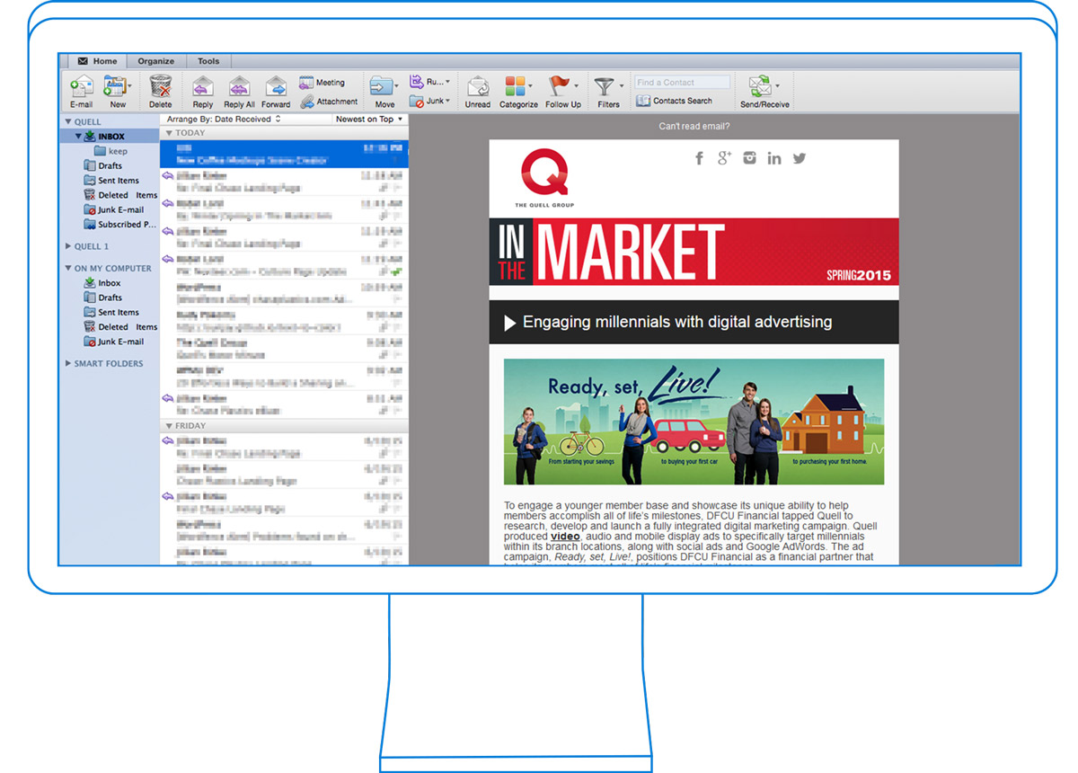
The Quell eblast had the highest budget of all of the ones listed here, and so I pulled out all the stops in the development process. This eblast is fully responsive, which is a major challenge when considering the compatibility of differing email clients. Click the link and try scaling the window. Everything will re-stack intelligently to portray all of the information in various sizes. While a regular eblast with a lot of content can weigh in at about 400 lines of code, a responsive one like this can tip the scales at well over 2,000, and nearly 200 separate tables!
Responsive design is critical in web design, but in email marketing, it’s still a bit of a niche. Not every email client supports it, and the added development time can be too much to justify in some cases. That said, it can create an air of professionalism and attention to detail.
