Shiloh Industries

Shiloh Industries website mockup

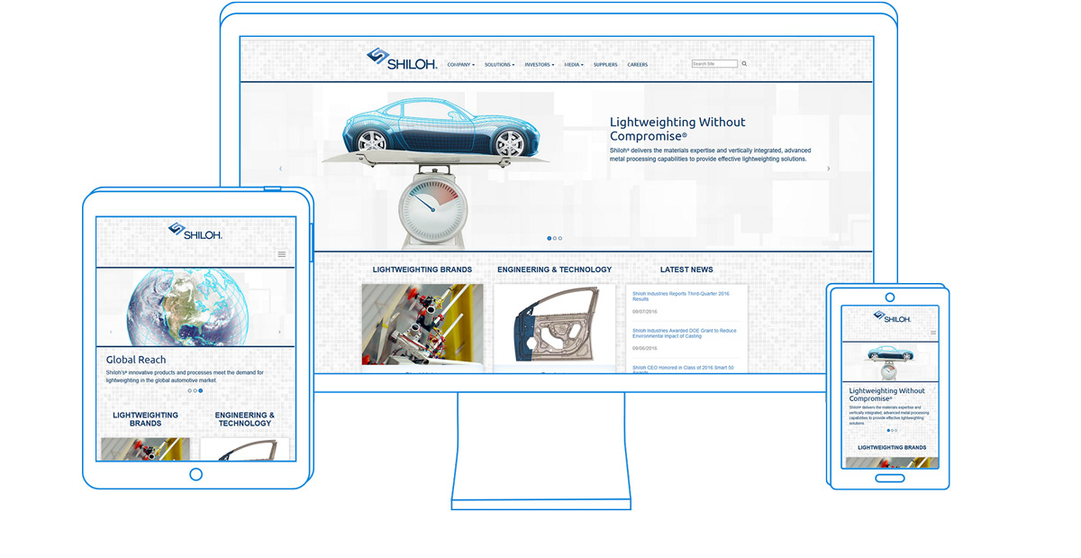
Shiloh Industries is an automotive technology company that specializes in lightweighting: finding ways to make parts lighter, while retaining — or even improving — strength. With this in mind, I developed a design for the website that is primarily white and light gray. This shows the lightness of their solutions, and also works with their tagline, ‘A Body in Light’, which itself is a play on the automotive design term ‘body-in-white’.

This design replaced their old website, which heavily focused on their dark blue color, with reversed white text. It was harder and more tiring to read. I kept many hints of blue throughout the style of the website in a cohesive single-color style.

Beyond just style, this website was a step forward in user experience. The Reports and Filings page used to be a large table that listed every legal document ever filed by the company. I created a more elegant sorting scheme where older documents are minimized. Finding this year’s documents is easy and fast, and the download links are clearly labeled. I also separated out annual reports and other permanent documents, which I placed on the sidebar for easy access from any page in the investors’ section.

Chase Plastics

Chase website mockup

With the Chase Plastics website design, I was given a pre-approved design and tasked with coding it all to make it work. This wasn’t the most straightforward task. For example, the locations page is a custom, vector-based map with clickable states/provinces that I developed. When a user clicks on either the state in the map, or the name of the state in the list, a box pops up which shows all of the salespeople assigned to that area. I coded it with jQuery to fill the box in with the appropriate salespeople based on a list kept in the code. Updating where the salespeople are assigned is a simple task. The code was all done in relative units so that the page scales, and is completely responsive, like the rest of the site. This couldn’t have been accomplished with a paid app – it had to be done from scratch.

Chase Plastics locations page

ChasePlastics.com locations page

The Chase website also has many forms throughout: a customer satisfaction survey, a credit application, a contact form, and several RSVP forms. It also has integration with a third party plastics search engine, which was integrated seamlessly into the website by working directly with the vendor and supplying a style sheet to help match the main website.

Air Caster

Air Caster website comp

I started designing Air Caster™ with lightness and air in mind. The company creates “air bearings”, devices that allow you to move super heavy items with streams of air kind of like an air hockey table. With that in mind, all of the colors are very light and airy, and there is a lot of white space to further enhance that feeling.

Since the client didn’t have many professional assets (mostly cell phone pictures), I illustrated a worker pushing different items on one of the air casters. This gave some visual interest to the web site while also implying all of the industries that the technology could be applied to.

The internal pages of the website are designed with a contact form and phone number always in the sidebar. Since the business does a lot of work with custom-made products, having easy access to the sales team is really important. The lack of large photos is mitigated by featuring one of the illustrations on each page, with a few of the images included in a smaller size throughout the copy.

Achates Power

Achates Power website mockup

Achates Power is a forward-thinking, high tech engine company that is developing an extremely efficient diesel engine. They wanted an Apple-inspired look, so we went with a very clean white design.

The coding on the homepage was a bit of a challenge. It’s a “card” theme, where the sections can slide in and out to display different content dynamically. Each section (“Our Formula”, “Proven Results”, etc.) pulls content from the most recent post in that category, and is ready to be displayed on screen as soon as the user clicks the button.

Every one of those sections is created with a simple web form that the client can fill out to post another entry easily without having to see any code, and without having to worry about missing anything.

The Magni Group

Magni website comp

The Magni Industries project was unique in the fact that it’s available in 8 languages – English, French, German, Japanese, Korean, Mandarin Chinese, Portuguese, and Spanish. This capability had to be retrofitted into the website after launch, and translation wasn’t a primary concern during the original development phase, which made this a special challenge.

That wasn’t the only challenge though. The Browse by Industry page has a sorting mechanism that allows the user to view all of the products available. The amount of categories, the number of sorting methods, and the number of products changed several times during development, making it very difficult to keep everything organized. Plus, the client wanted buttons on the home page that would click through to this page, already sorted based on what the user clicked. This required heavy programming to make sure that worked fluidly.

Art on the Bay

Art on the Bay website mockup

Art on the Bay is a local craft festival in New Baltimore, MI. It allows local art and food vendors to display and sell their work. Unfortunately, their website had a few issues.

Although it was designed by a professional, it was lacking some features that the event committee wanted. Namely, the ability to submit applications and pay for booth space online. Previously, artists, food vendors, sponsors, and volunteers had to print out applications and mail them to the committee, who would process them manually. We kept that as an option but added the ability to handle these things online, and make payments through PayPal.

Another issue with the old version of the site was the lack of mobile compatibility. It was built with a web builder that doesn’t offer the option of responsive design. This is critical for smartphone users who want to attend the show and just want to check the address or look at the map.

Read more about this project in the blog, including the problems with using web builder technology.