Your logo is your company’s first impression. It’s important to have that logo speak to your values and brand. Recently, Rad Rat helped a new local cleaning company, Mr. and Mrs. Clean.
Mr. and Mrs. Clean is a husband and wife team. They specialize in window washing and office janitorial work – dusting, vacuuming, mopping, and the like.
In order to get the business off to a good start, we needed to develop a logo and print some business cards, as well as a professional-looking invoice and a letterhead set. Referrals are important in the cleaning industry, so having leave-behind items that customers can share with friends and neighbors can make or break a company.
Logo design discussion
The first step in designing a logo is understanding the feel of the company. In this case, it’s a small, approachable, friendly neighborhood business.
There are 3 major types of designs – word marks, icons, and full logos.
Wordmarks
Wordmarks are simple and elegant.
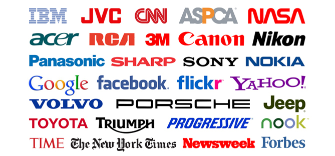
Wordmarks are simply the name of the business typeset in an aesthetically pleasing way. Some major examples are FedEx, Google, Volvo and Panasonic. Wordmarks typically have more of a corporate, big business feel to them. Aside from the colors, there isn’t very much to look at from an artistic sense. In this case, we passed on that option.
Icons
Icons are small graphics that identify your company. An example is AT&T. The connected globe gives an idea about the type of services they offer. The new Microsoft icon is just 4 colored squares. In each case, the icon accompanies the name in plain text. Icons are the most popular method of brand identification now, in part due to web and mobile limitations – icons can be app shortcuts, browser favicons, or any other small scale identifier. And the name of the company can appear next to the icon or below it, depending on the space available. If your company is going to be developing a major web presence (and it probably should), icons are an excellent option.
Logos
In the world of small business cleaning, though, a more traditional design can be preferable. You don’t need the person who dusts your desk on the weekend to have their own app and operate like a billion dollar Silicon Valley startup. A more homey, the-way-mom-used-to-do-it feel is attractive to potential customers. For this reason, we chose a traditional full logo to represent Mr. and Mrs. Clean.
A full logo marries a wordmark and an icon. The designer can lay out the text in a very particular way, which allows for a more interesting design, at the cost of the loss of flexibility.
Logo development
When actually designing the logo, it’s important to start with the one-color version. One color logos are used in a lot of applications – t-shirts, promotional items, stamps… you name it. Often, full color printing isn’t available, or cost prohibitive. After the design is finalized, you can always add more dimension and interest with color.
Here are a few of the quick logo sketches for Mr. and Mrs. Clean.
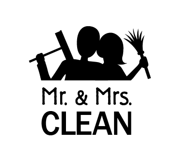
This first option is an illustration of the couple, with the husband holding a squeegee and the wife holding a feather duster. If you see the logo, you know what the company is all about. It’s a married couple, and they do windows and cleaning. The fonts were chosen to balance a handmade touch, and a modern, clean result.
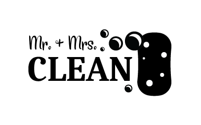
This second option is much more traditional. Inspired by cleaning product labels from the ’50s, this logo exudes old fashioned hard work by hand. It also introduces some branding elements, like the bubbles and the sponge. They can be used in other design materials for a more cohesive brand.
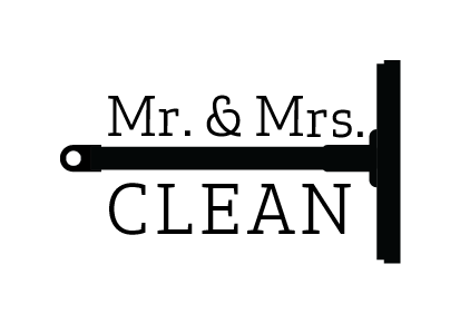
Finally, I wanted to show them a simpler option, and some different font choices. This design is the weakest as it appears here, but could have been developed further if they liked the direction it takes.
Adding color
After choosing a logo and making some tweaks, the next step is to add some color. Many cleaning companies use blue – especially ones that work on windows. We wanted to avoid appearing cliché, so we focused on gold and green. Gold implies that the company is the best – the gold standard. Green is natural and clean.
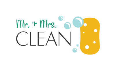
I balanced the hues and values so that the colors can work together in different ways. The logo works against light and dark backgrounds while remaining legible. For added authenticity, I also matched the green color to be very similar to a common commercially available sponge.
Ready to start your logo or other design project? Contact me in the sidebar to get started!