Chase Plastics: Trade Show Trends

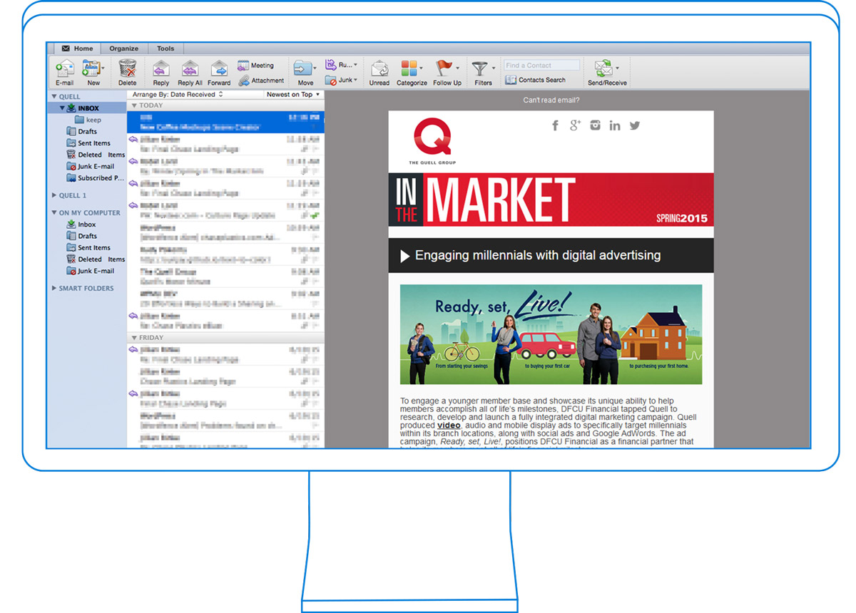
Chase eblast mockup

Chase Plastics is an international plastic and resin distributor, and they spend a lot of time at trade shows, talking about the products they carry. Every time a show comes up, I make an email blast to prospective attendees, and after the show, I make one to send to all of the new prospects that they gathered while they were there.

Chase likes to mix up the template every couple of eblasts to keep things fresh. This is just one of the many different variations that have arisen over the past couple of years. I create new images and assets for each new version and code it. I also pay special attention to testing this one in old versions of Outlook because of the client’s request.

The Quell Group: In The Market

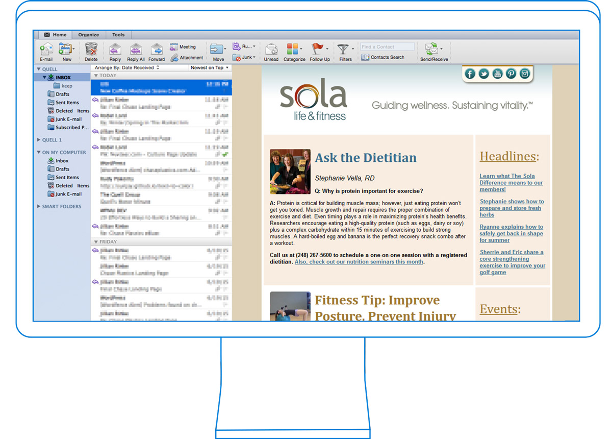
Quell eblast mockup

The Quell eblast had the highest budget of all of the ones listed here, and so I pulled out all the stops in the development process. This eblast is fully responsive, which is a major challenge when considering the compatibility of differing email clients. Click the link and try scaling the window. Everything will re-stack intelligently to portray all of the information in various sizes. While a regular eblast with a lot of content can weigh in at about 400 lines of code, a responsive one like this can tip the scales at well over 2,000, and nearly 200 separate tables!

Responsive design is critical in web design, but in email marketing, it’s still a bit of a niche. Not every email client supports it, and the added development time can be too much to justify in some cases. That said, it can create an air of professionalism and attention to detail.

Public Relations Society of America (PRSA)

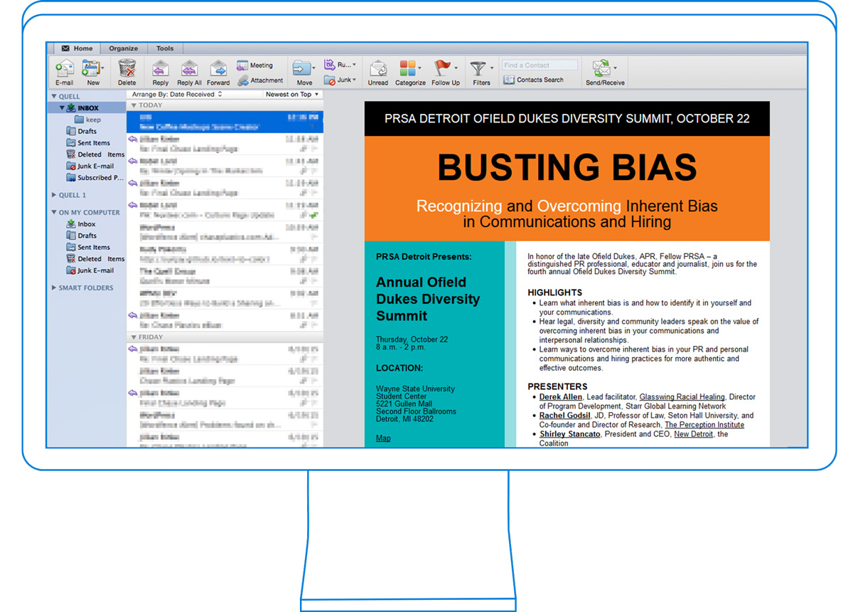
PRSA eblast mockup

The PRSA eblast was created by a print designer, and had to be heavily adapted and edited to work within the constraints of email code rendering. The original version had overlapping images and text wrapping around main image in the body of the email. Since these things aren’t possible, the simple solution would be to create it as an image and just send the image in an email. It would retain the exact design and style, but that method has some major flaws.

First of all, the width of the eblast has to be within a reasonable range so that the recipients don’t have to scroll around too much horizontally. That can cut interaction down by a huge percentage.

Second, the file size of an email made completely of images is a lot bigger than it should be, which causes long load times. Making a user wait for content is too much to ask for an eblast like this.

Third, spam filters can be an issue. Having a large email with very little text is a warning sign, because it’s a method often used by spammers to display words on screen that would usually get caught in filters as plain text. Emails should be weighted about 80% text and 20% images to be seen as legitimate.

With all of that in mind, I recreated the print document from scratch, using email-friendly fonts and sizes. I was able to create a table that carefully hid where all of the cell borders were so that the original design was retained as closely as possible. I used some programming tricks to use as few images as possible.

Sola Life and Fitness

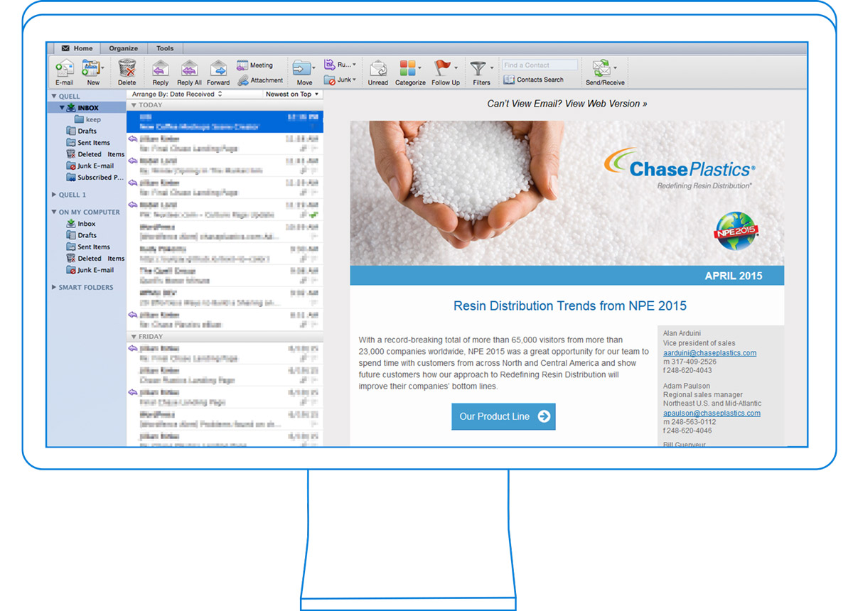
Sola eblast mockup

The Sola email newsletter is a great example of how excellent content can drive reader interaction. This email had an open rate of 44.4%, and a click rate of 20.6%! These numbers are super high. It speaks to the quality of the list that Sola compiled, the attractive design that caught the recipient’s interest, and the compelling content to keep them reading.
Although the original design was created by a designer and not a coder, I was able to adapt it to work within the constraints of email design without losing the original look and feel.